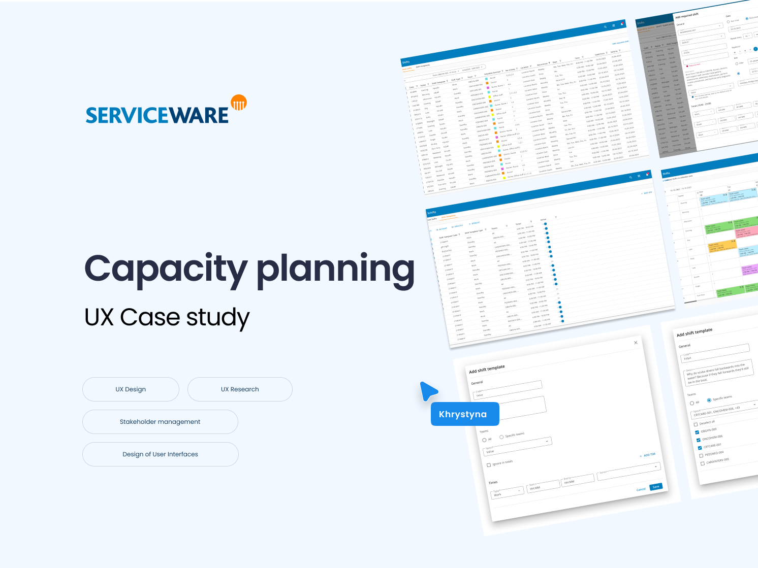
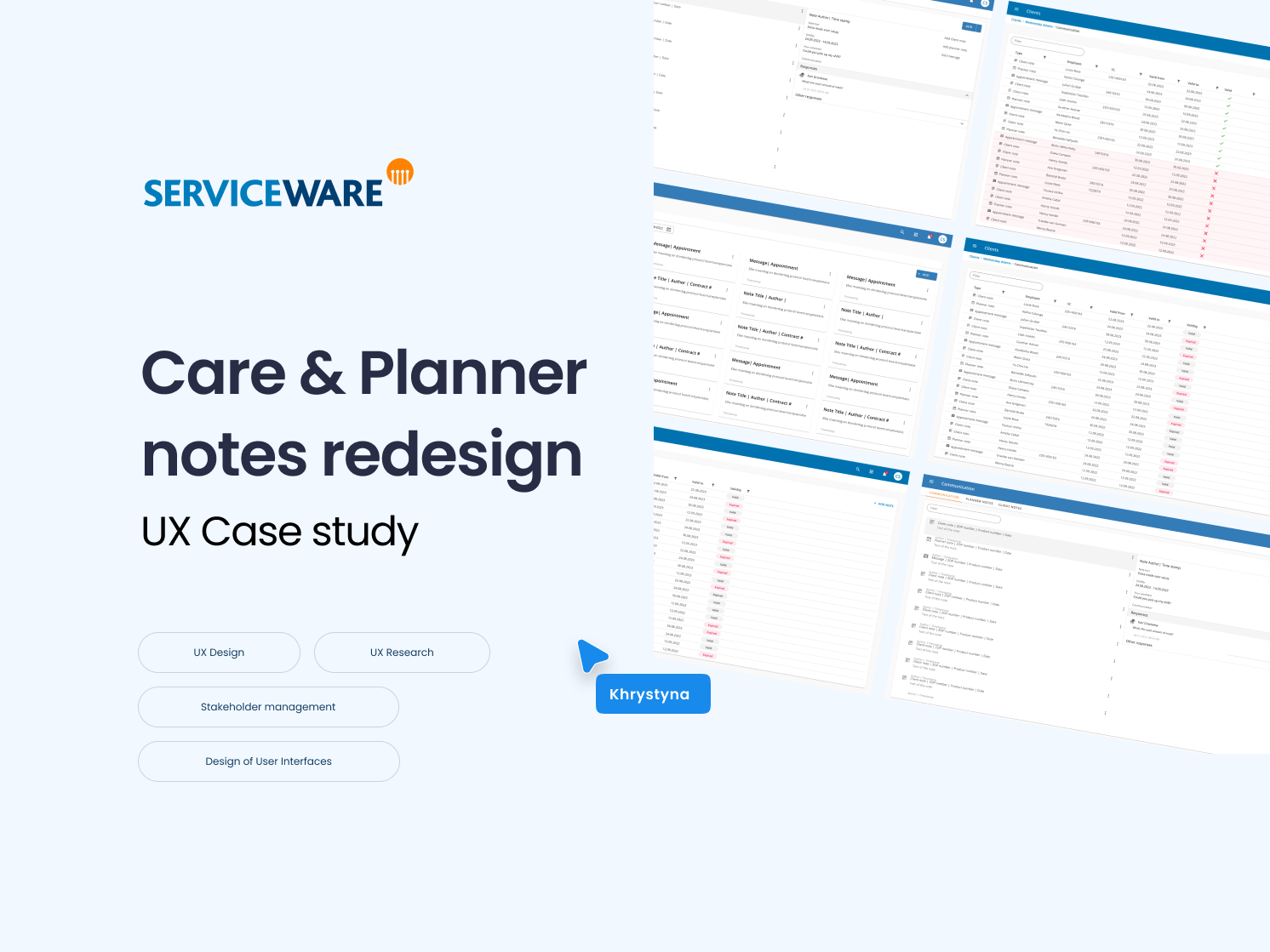
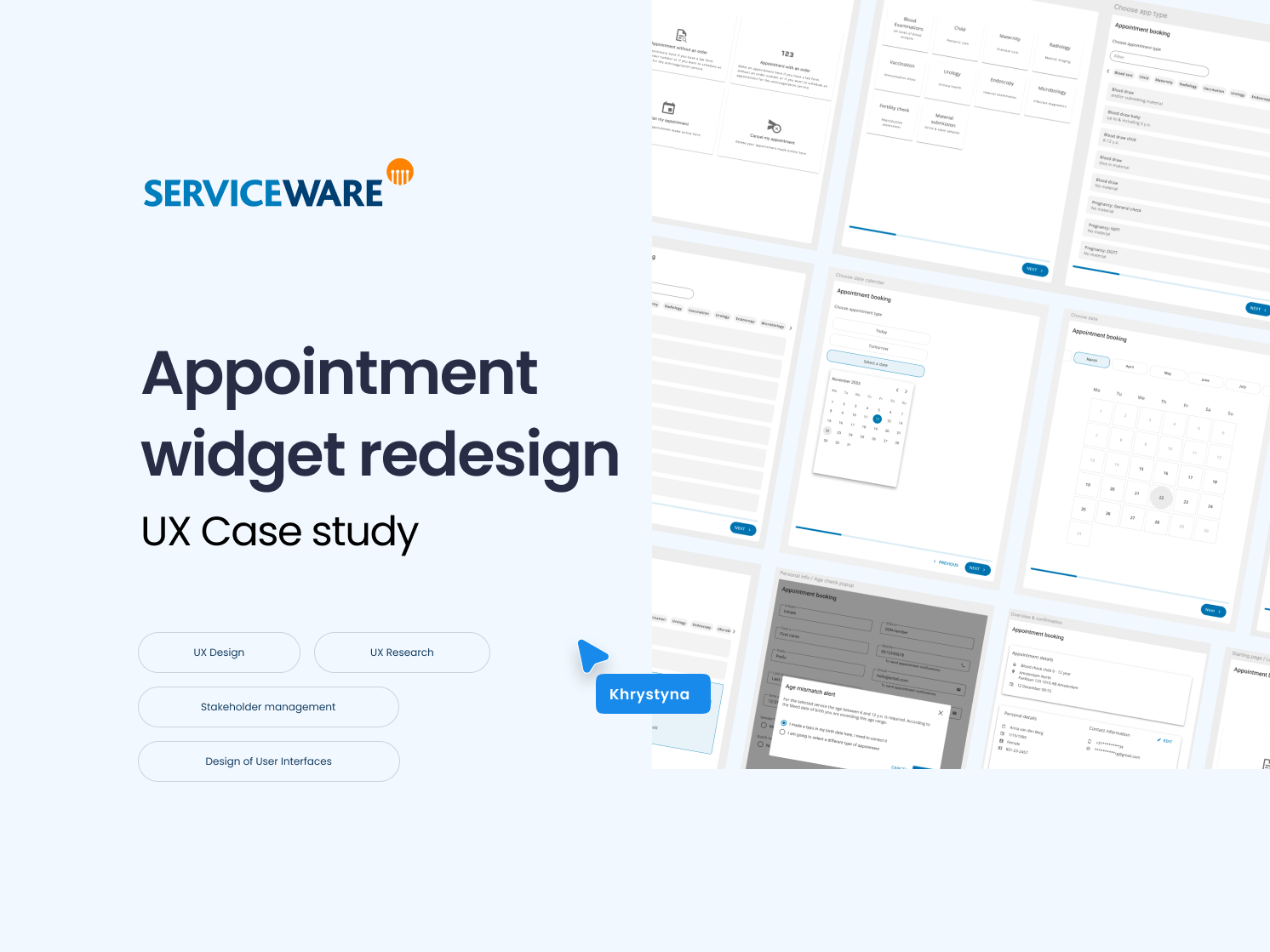
This concept was part of an internal design challenge at one of my previous projects. The goal was to improve readability, hierarchy, and user decision-making for a financial reporting dashboard. The original version suffered from overcrowded data visuals and unclear groupings.
I redesigned the layout to create better contrast (both Light and Dark modes), intuitive information flow, and a more scalable structure — especially for power users working with large volumes of data daily.
Before
After


